MealMate
A Meal Planning and Logging App for Individuals with Eating Disorders
Duration
May 2023 - June 2023
Client Role
Professor Vu Chu, UI / UX Designer
University of Washington Bothell
Overview
The case study focuses on the design and prototyping process of MealMate, an innovative mobile application aimed at assisting individuals with eating disorders in documenting and managing their meals effectively. This overview highlights the key objectives, target audience, and the overall design approach taken during the development of the app.
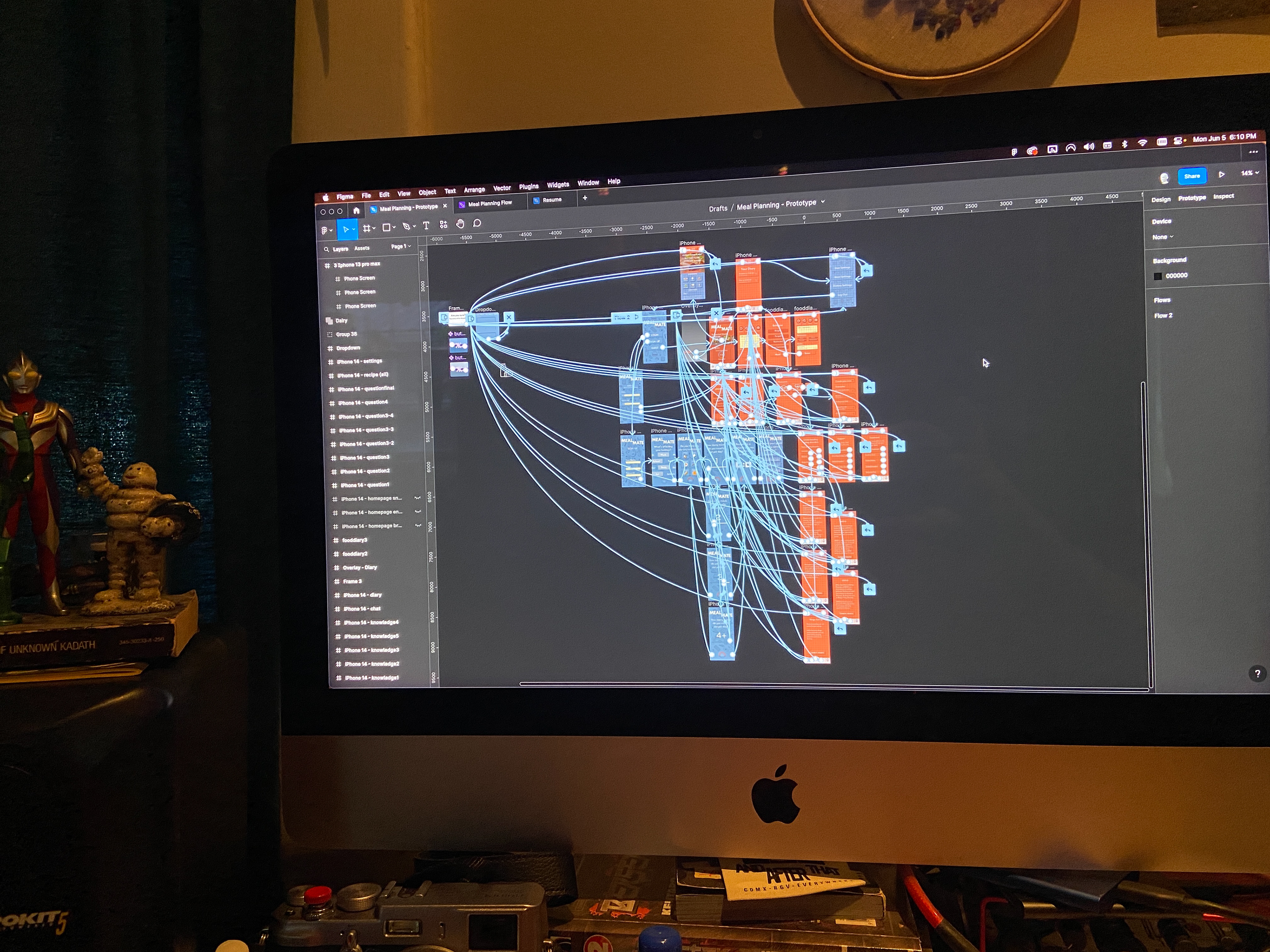
Working through the prototype in Figma, that's a lot of threads!
Problem
During the initial testing phase, my focus was geared more towards general meal planning apps and websites, which all seemed to be geared towards fitness. One of my test subjects pointed out that a lot of the language used in these apps seemed to be involved in losing weight and getting thin. They noted that this kind of language can be triggering for individuals that have troubled relationships with eating, who just need to be focusing on getting food into their bodies and not so much on their body image.
User Research
When finding competitors for a meal plan service, four different apps were initially looked at for the user research. These apps were PlateJoy, eMeals, Eat This Much, and PrePear.
When finding competitors for a meal plan service, four different apps were initially looked at for the user research. These apps were PlateJoy, eMeals, Eat This Much, and PrePear.
Based on the comprehensive evaluation, Eat This Much emerged as the most suitable choice for individuals seeking an individual-focused, paywall-free, and easily accessible meal planning app. The app's robust features, customization options, and commitment to providing a valuable free experience also made it the ideal testing ground for our target audience.
The user was then instructed to plan a week’s worth of meals according to a specific meal plan. User is vegetarian and they need at least 15-30 grams of protein per meal. They need 3 different meals per day (21 meals). They will sign up for a free account to save meals (there is a premium option but we won’t be using this). They will then save 7 meal plans to their account (3 per day, 21 meals).
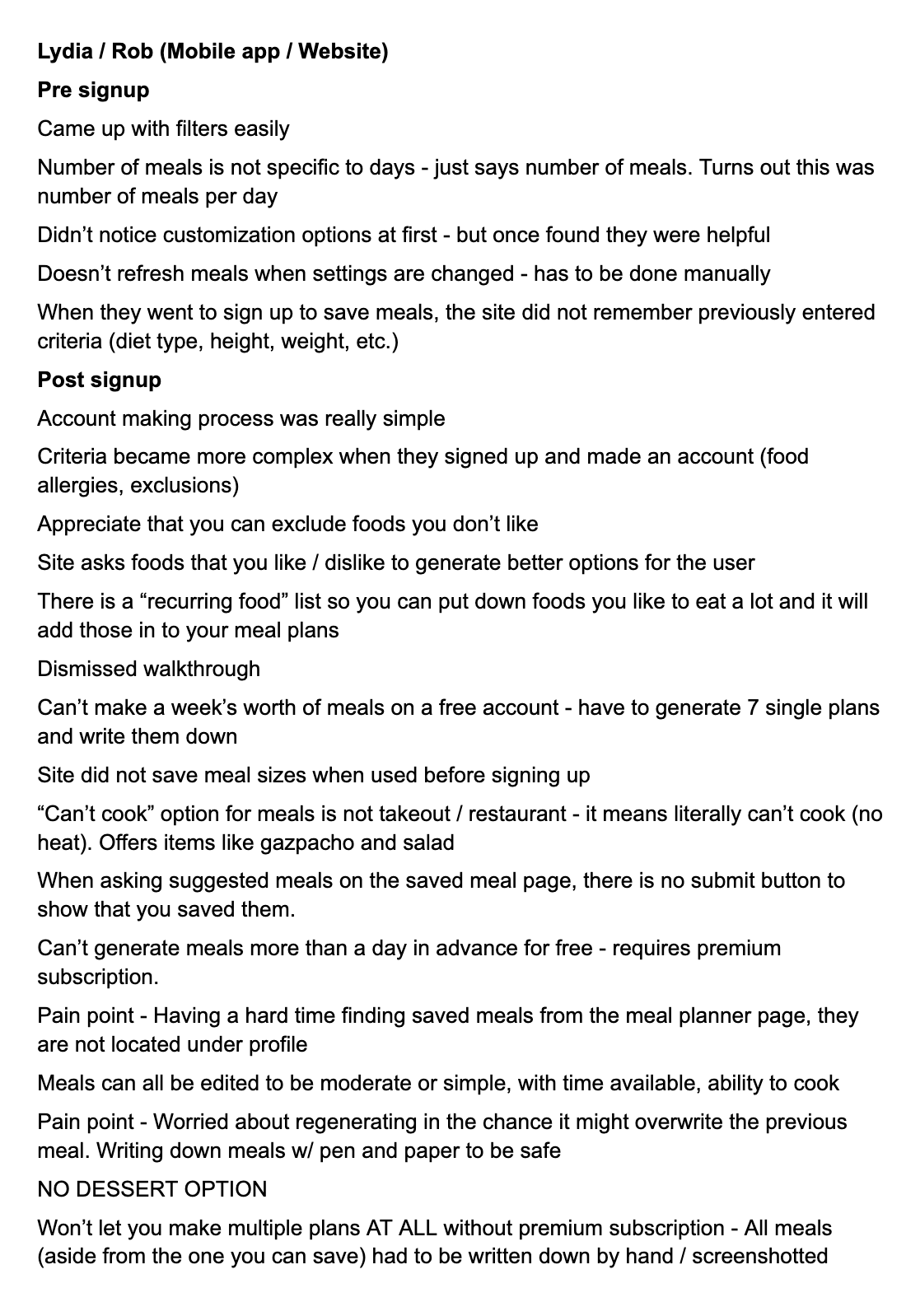
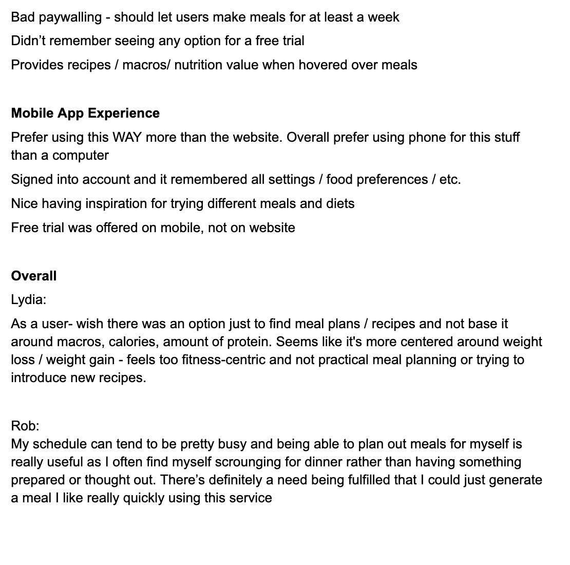
Initial notes on the user research phase
User Needs Analysis
After the research phase, there were many user needs that surfaced from the feedback the users provided. However, it was one specific need that stuck out to me as an opportunity to make something more holistic and centered towards social justice. One user (my partner) noted that many of these apps were very fitness-centric and seemed harmful to those who may have eating disorders or an unhealthy relationship with eating.
Additional Research
In order to gain a comprehensive understanding of eating disorders and ensure the development of a sensitive and effective meal planning app for individuals with eating disorders, additional research was conducted. The app Brighter Bite played a crucial role in providing background education on eating disorders, resources for seeking help, and gave a lot of guidance on the appropriate language to use when discussing eating disorders. It also helped provide me with a great foundation on how to structure this kind of app in a user-centric way, keeping them in control.
None of this would be possible without the BrighterBite app
Ideation
User flow
My main goal around this app was to give the users a holistic approach to their eating and keeping them in control at all times. The intended audience is geared towards those who have some understanding of their eating disorder and need a service to help keep them on track. Because of this, I wanted the onboarding process in the wireframe and user flow to be very customizable and individualized.
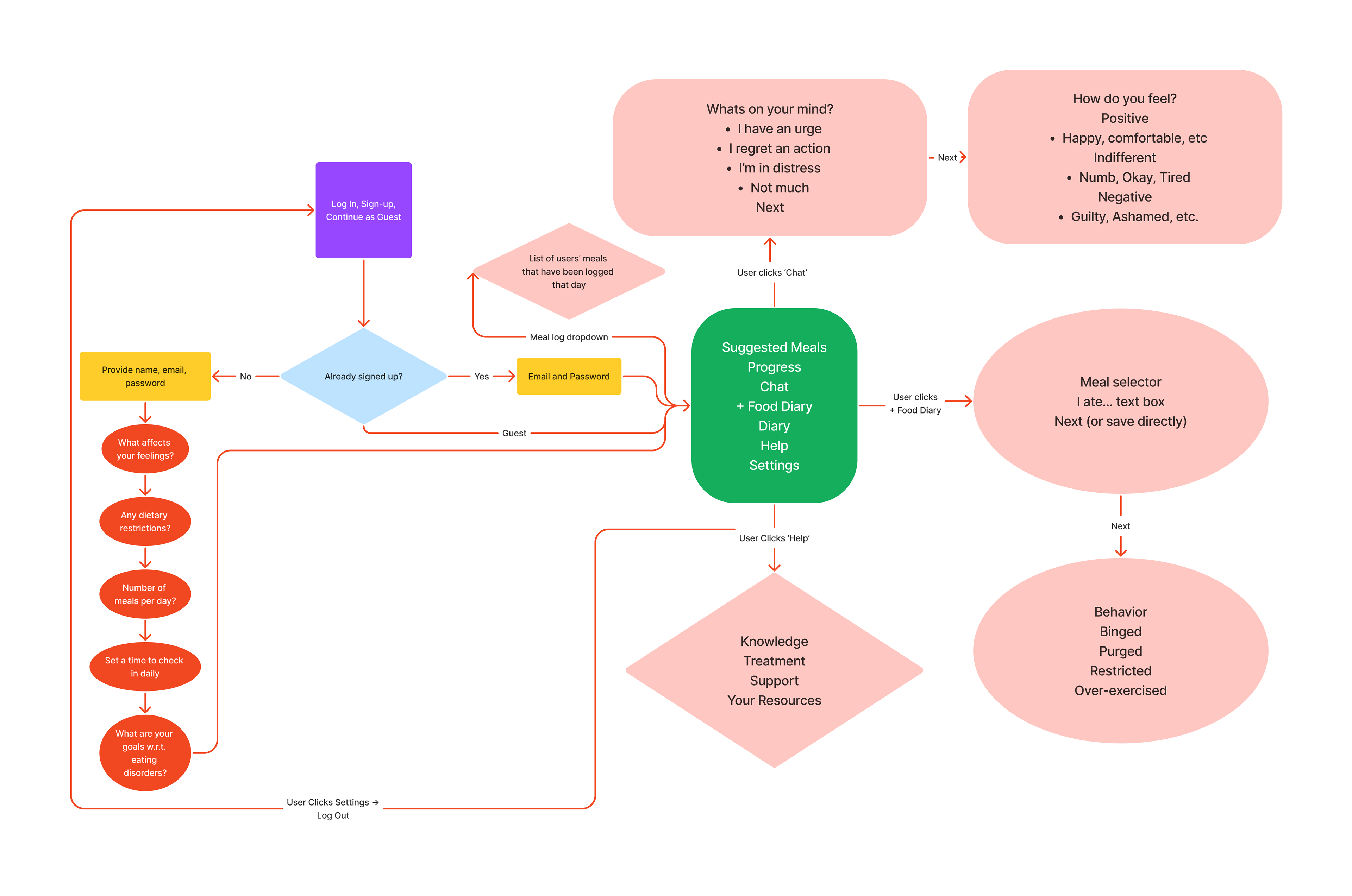
Draft of User Flow
Information Architecture
Keeping that holistic approach in mind, I wanted to break the app down into its most basic functions and uses. Since much of this app is a place for the user to log and track their eating, I wanted that to be the main focus. There are some suggested meals based on the users dietary restrictions (allergies, religious, vegan/vegetarian), but otherwise this is mostly where the user can track their progress, log their meals, or keep mood diaries about their feelings.
I found inspiration from Brighter Bite in keeping the focus on the users emotions and feelings around eating. And having a place for them to do that could help improve their condition. Additionally, there is a Help page with various resources for them to reach out to.
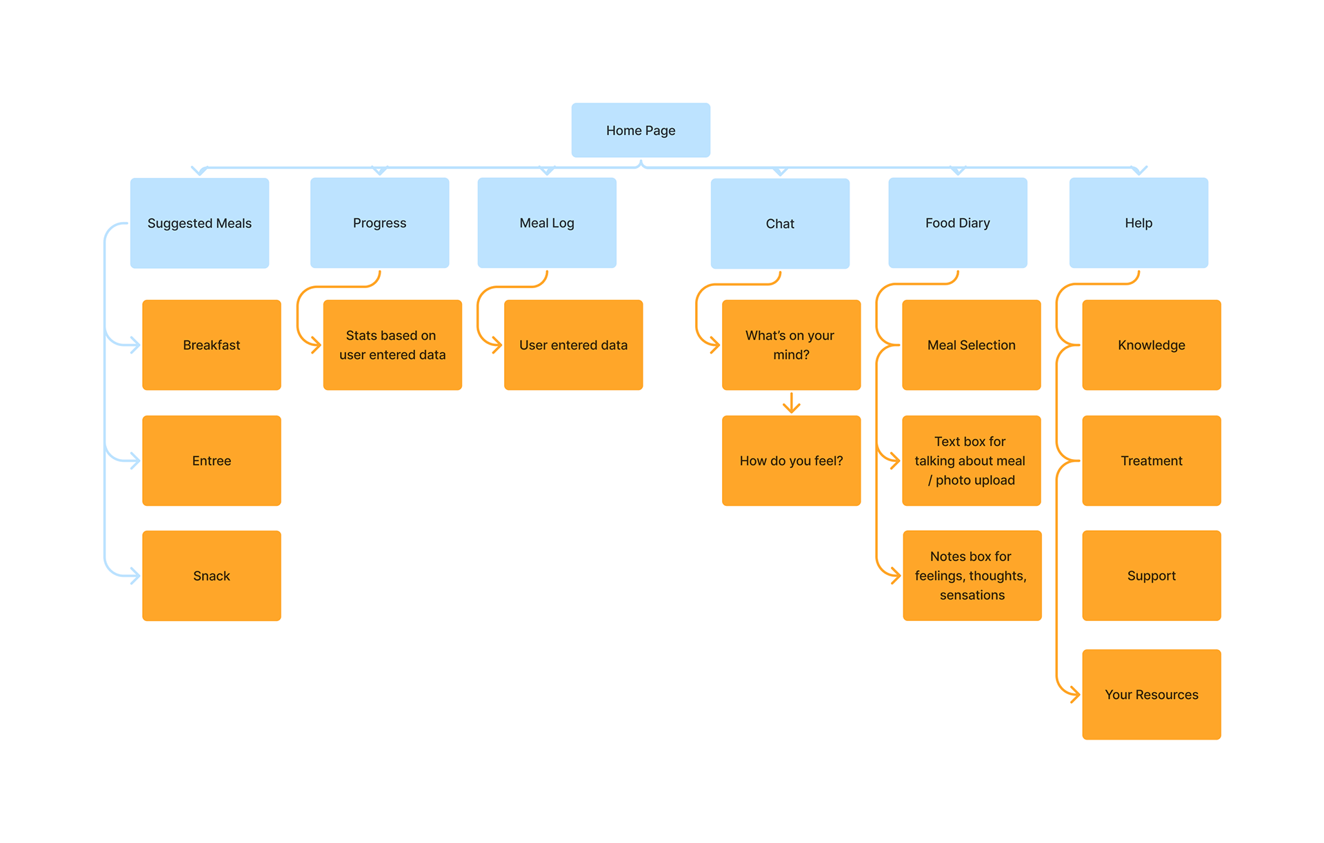
Information Architecture diagram
Wireframe
The initial idea for the app was to be more centered around cooking and recipes, but as the concept went further towards that user-centric, emotional approach, it was quickly abandoned in favor of that approach. The carryover, however, was the look and feel from this first draft wireframe, which is why I included it here.
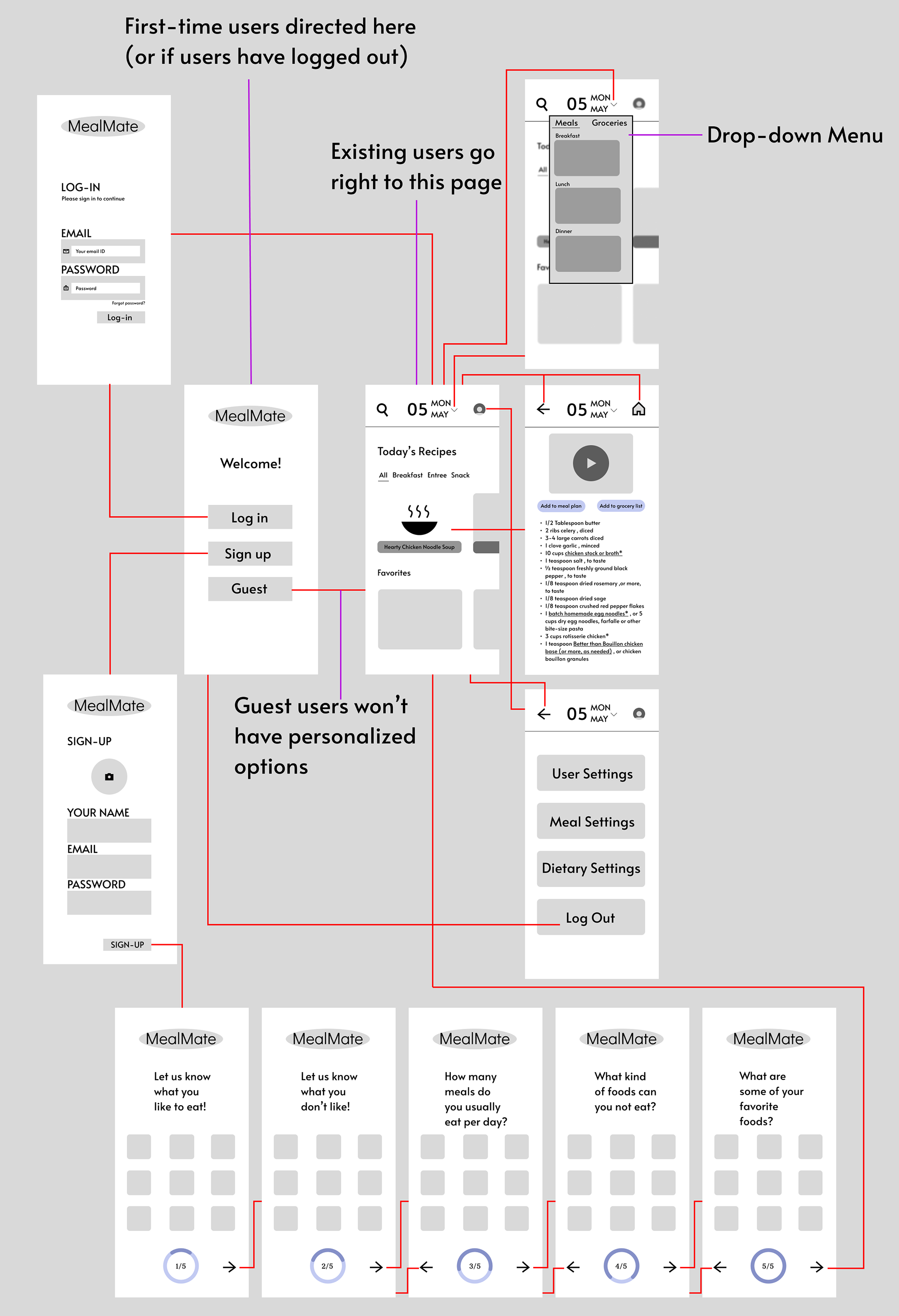
First draft wireframing
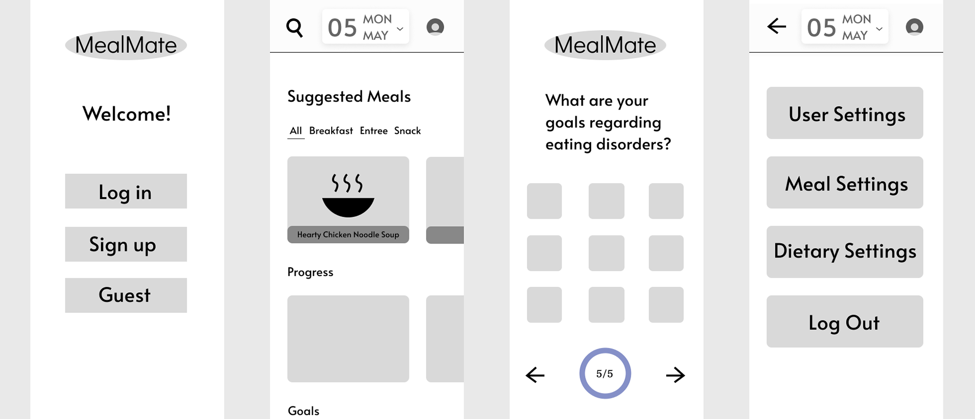
Updated wireframes, before adding the Help, Chat, and Diary sections
User Testing
With this wireframe and prototype draft made, I had some of my cohort try out the app and provide notes / ideas that came up when testing.
Some big takeaways from the test were that users appreciated a good amount of whitespace, and didn't want things getting too busy; being able to save meals you've eaten so you can go back to them easily; having the user enter some fear foods they have (some vocabulary I learned). It was also noted that the app overall seemed like a pretty straightforward food app, and that shaping it more to the intended audience could help it stand out.
With this feedback I was able to go back and refine many aspects, as well as remove unnecessary elements that detracted from the overall concept and audience.
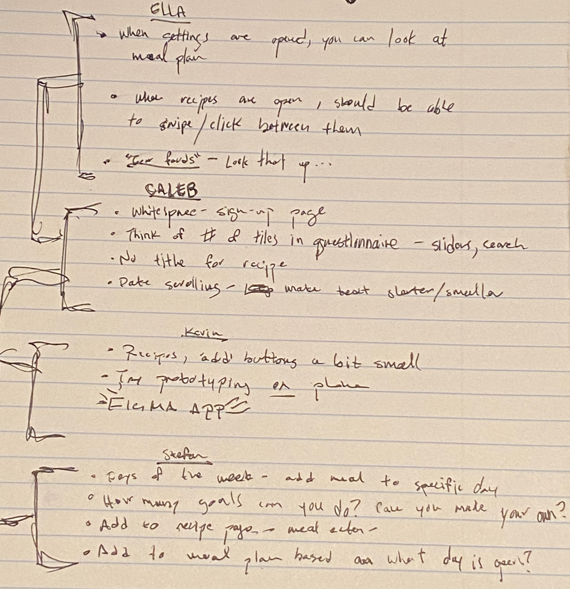
Some handwritten notes from the user testing phase
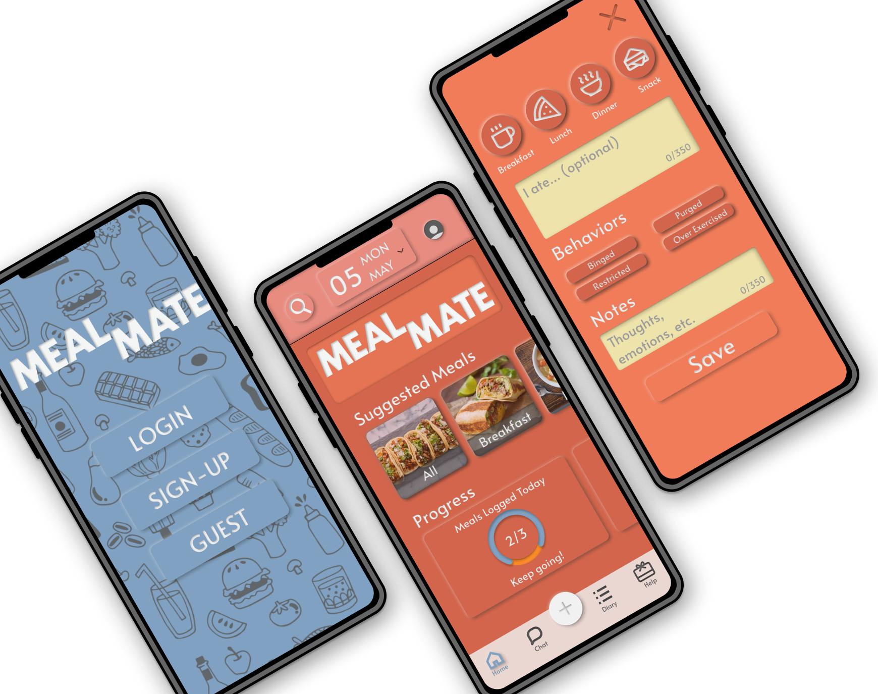
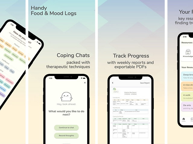
Refined Results
With the feedback I had received and some guidance from my professor, I was able to refine my design to be much more focused to the intended audience, as well as having a cohesive visual look that helped the app look more professional and accurate. With a neumorphic design and refreshed color palette, the app has much more depth and interactivity. Try the prototype below!
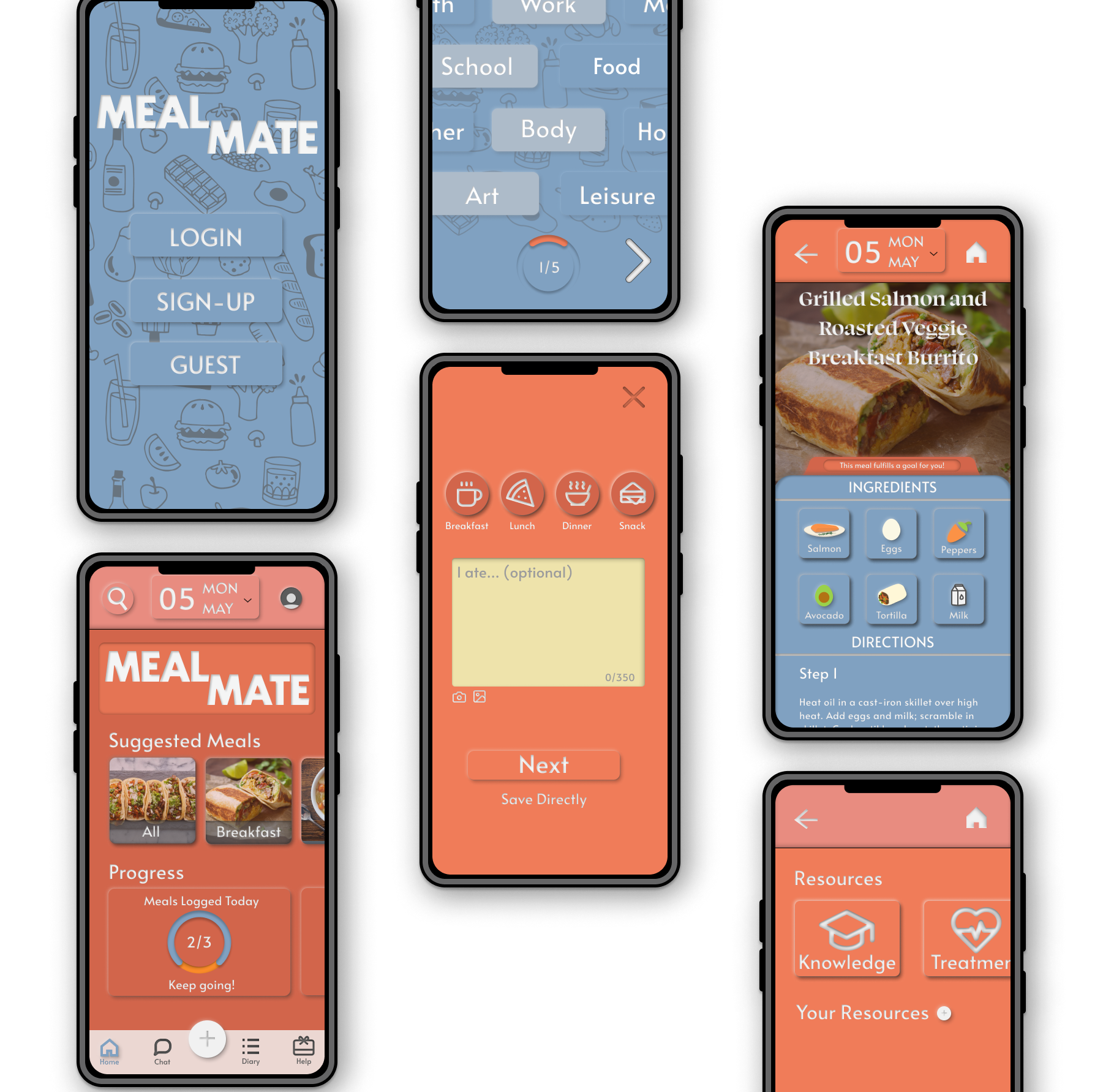
Refined Screens
Conclusion / Thoughts
This was my first project seeing a UI / UX design through from start to finish, and it was an extremely awarding experience. Being able to test out existing apps by observing users, find the gaps where I could create something new, and designing a working prototype like this was so informative on the design process.
Some key insights I picked up from this project were:
- Empathizing with potential users and finding places where they feel welcome
- Not being afraid to abandon ideas that aren't contributing to your core concept
- The value in observation and letting users tell you what they want
- Don't be afraid to ask for insights and help, you don't want tunnel vision
- An ounce of effort in preparation will lead to a ton of time and grief spared in the end (specifically when you're making wireframes and sketches)