A game about a colony of cats surviving in an unyielding wilderness.
Lead your friends to safety as you hunt, play and explore the world!
Duration
Feb 2023 - Mar. 2023
Client Role
Dr. Mark Chen, UI / UX Designer
University of Washington Bothell Lead Writer
Overview
The purpose of this case study is to explore the game design process behind "Cat Friends!" - a survival game that draws inspiration from renowned titles like Oregon Trail and Stardew Valley. In this game, players take on the role of a young cat who must lead a colony through a challenging and unforgiving wilderness, facing various obstacles and making critical decisions along the way. Our assignment was focused around developing a system, how we can teach those systems to others through games, and how games can expand on the learning process. This case study delves into the key elements and considerations that shaped the design of this game.
Concept
As this assignment began, we were given some ideas and themes to go with by our professor. With the main idea being focused around the philosophy of absurdity and making "un-winnable" games that carry some kind of thematic message.
This game focuses on a theme of mortality and the inevitability of death. There is no true “win condition” in the game; a player’s game ends when their character dies for one reason or another. The value of their death comes from how they played the game and lived the life of their cat. The story of the player’s character may end, but the player could die with honor, die alone, lead their colony to safety or their demise, and so on.
Story
The story follows a young cat, raised to adulthood by their parents, whom they eventually lose. The kitten grows to adulthood and assumes responsibility for a small colony of cats, whom they lead through a world full of adventure and danger.
The twist to this game is that there is no way to truly “win”. The player will always perish at some point depending on how they maintain their resources and manage their colony. The goal is not to achieve some ultimate goal, but to find purpose in the way the player lives their life.
Gameplay Features and Concepts
After the research phase, there were many user needs that surfaced from the feedback the users provided. However, it was one specific need that stuck out to me as an opportunity to make something more holistic and centered towards social justice. One user (my partner) noted that many of these apps were very fitness-centric and seemed harmful to those who may have eating disorders or an unhealthy relationship with eating.
Additional Research
In order to gain a comprehensive understanding of eating disorders and ensure the development of a sensitive and effective meal planning app for individuals with eating disorders, additional research was conducted. The app Brighter Bite played a crucial role in providing background education on eating disorders, resources for seeking help, and gave a lot of guidance on the appropriate language to use when discussing eating disorders. It also helped provide me with a great foundation on how to structure this kind of app in a user-centric way, keeping them in control.
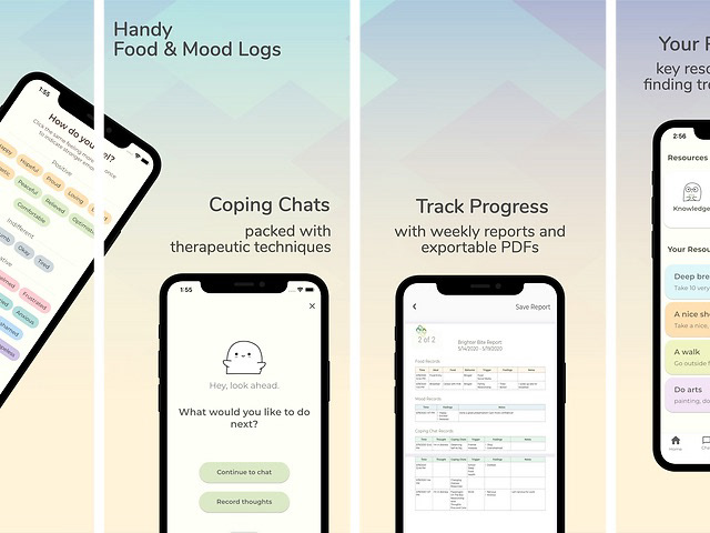
None of this would be possible without the BrighterBite app
Ideation
User flow
My main goal around this app was to give the users a holistic approach to their eating and keeping them in control at all times. The intended audience is geared towards those who have some understanding of their eating disorder and need a service to help keep them on track. Because of this, I wanted the onboarding process in the wireframe and user flow to be very customizable and individualized.
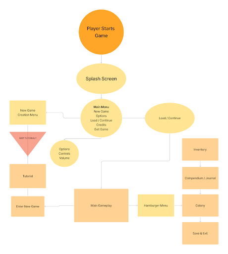
Draft of User Flow
Information Architecture
Keeping that holistic approach in mind, I wanted to break the app down into its most basic functions and uses. Since much of this app is a place for the user to log and track their eating, I wanted that to be the main focus. There are some suggested meals based on the users dietary restrictions (allergies, religious, vegan/vegetarian), but otherwise this is mostly where the user can track their progress, log their meals, or keep mood diaries about their feelings.
I found inspiration from Brighter Bite in keeping the focus on the users emotions and feelings around eating. And having a place for them to do that could help improve their condition. Additionally, there is a Help page with various resources for them to reach out to.
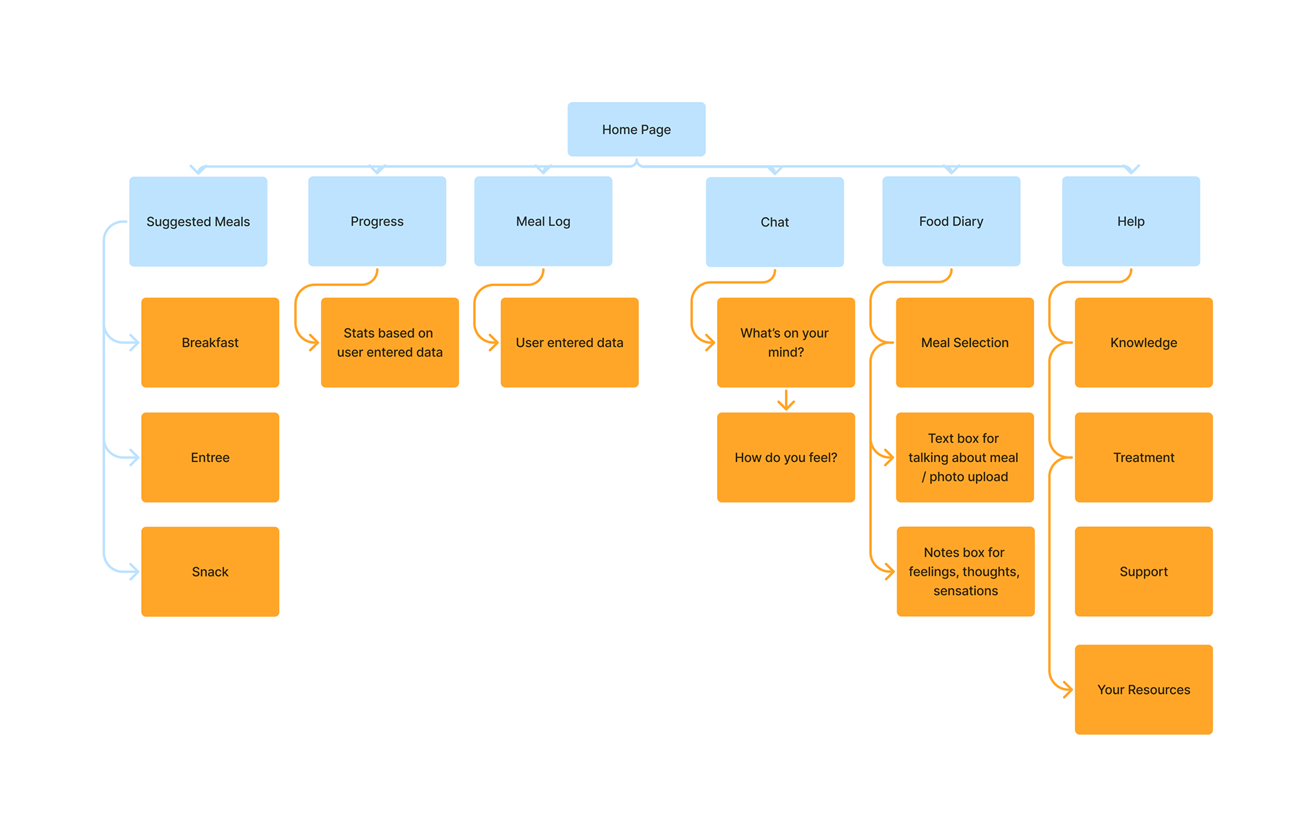
Information Architecture diagram
Wireframe
The initial idea for the app was to be more centered around cooking and recipes, but as the concept went further towards that user-centric, emotional approach, it was quickly abandoned in favor of that approach. The carryover, however, was the look and feel from this first draft wireframe, which is why I included it here.
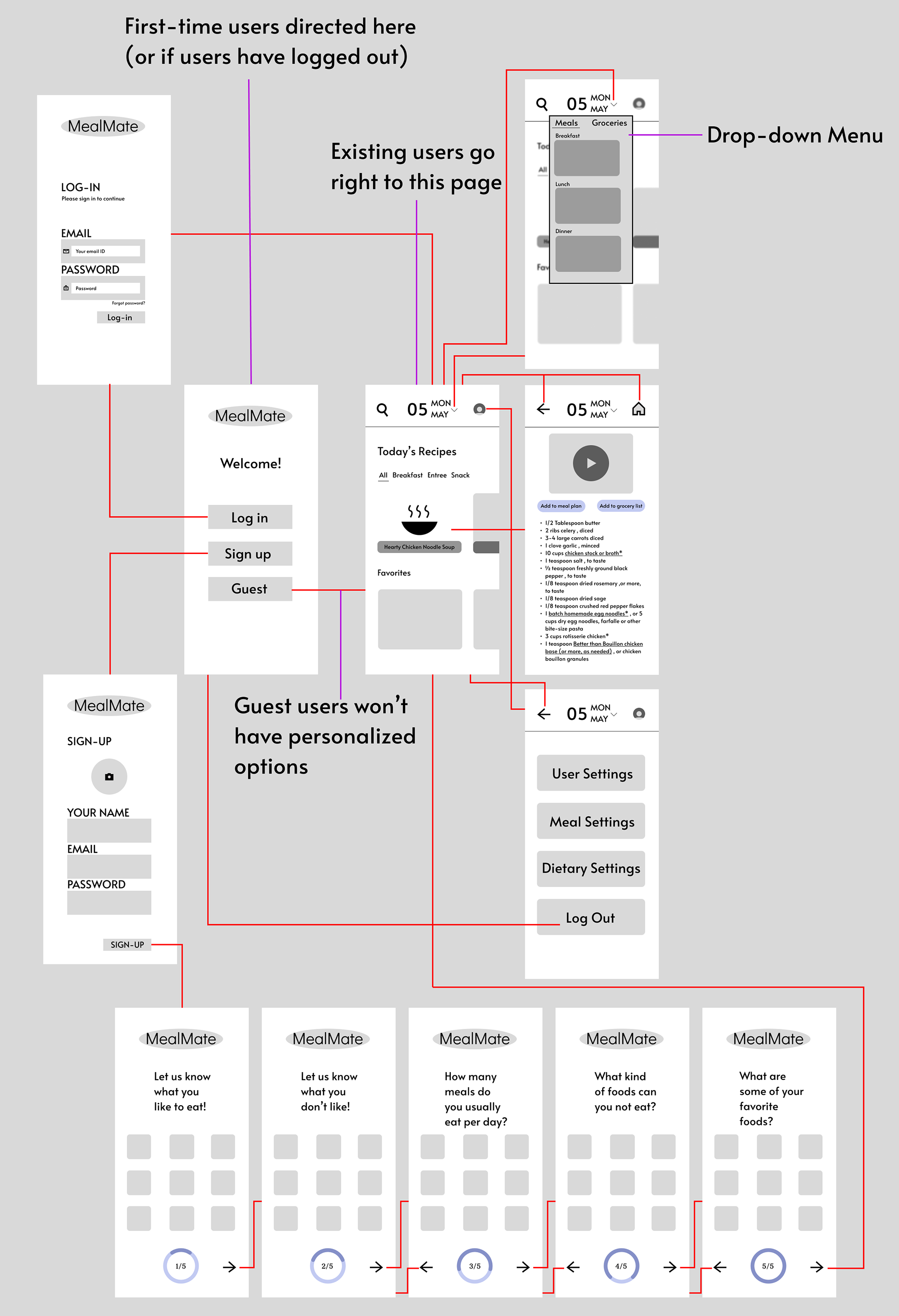
First draft wireframing
Updated wireframes, before adding the Help, Chat, and Diary sections
User Testing
With this wireframe and prototype draft made, I had some of my cohort try out the app and provide notes / ideas that came up when testing.
Some big takeaways from the test were that users appreciated a good amount of whitespace, and didn't want things getting too busy; being able to save meals you've eaten so you can go back to them easily; having the user enter some fear foods they have (some vocabulary I learned). It was also noted that the app overall seemed like a pretty straightforward food app, and that shaping it more to the intended audience could help it stand out.
With this feedback I was able to go back and refine many aspects, as well as remove unnecessary elements that detracted from the overall concept and audience.
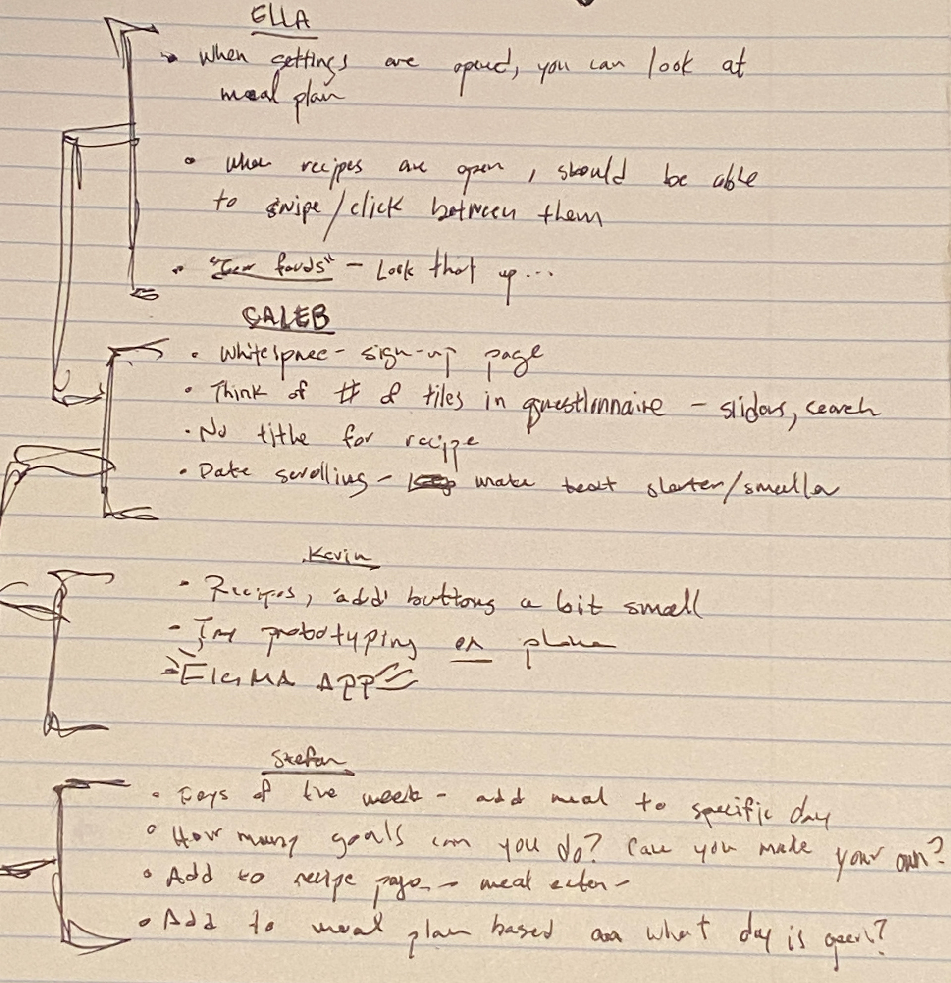
Some handwritten notes from the user testing phase
Refined Results
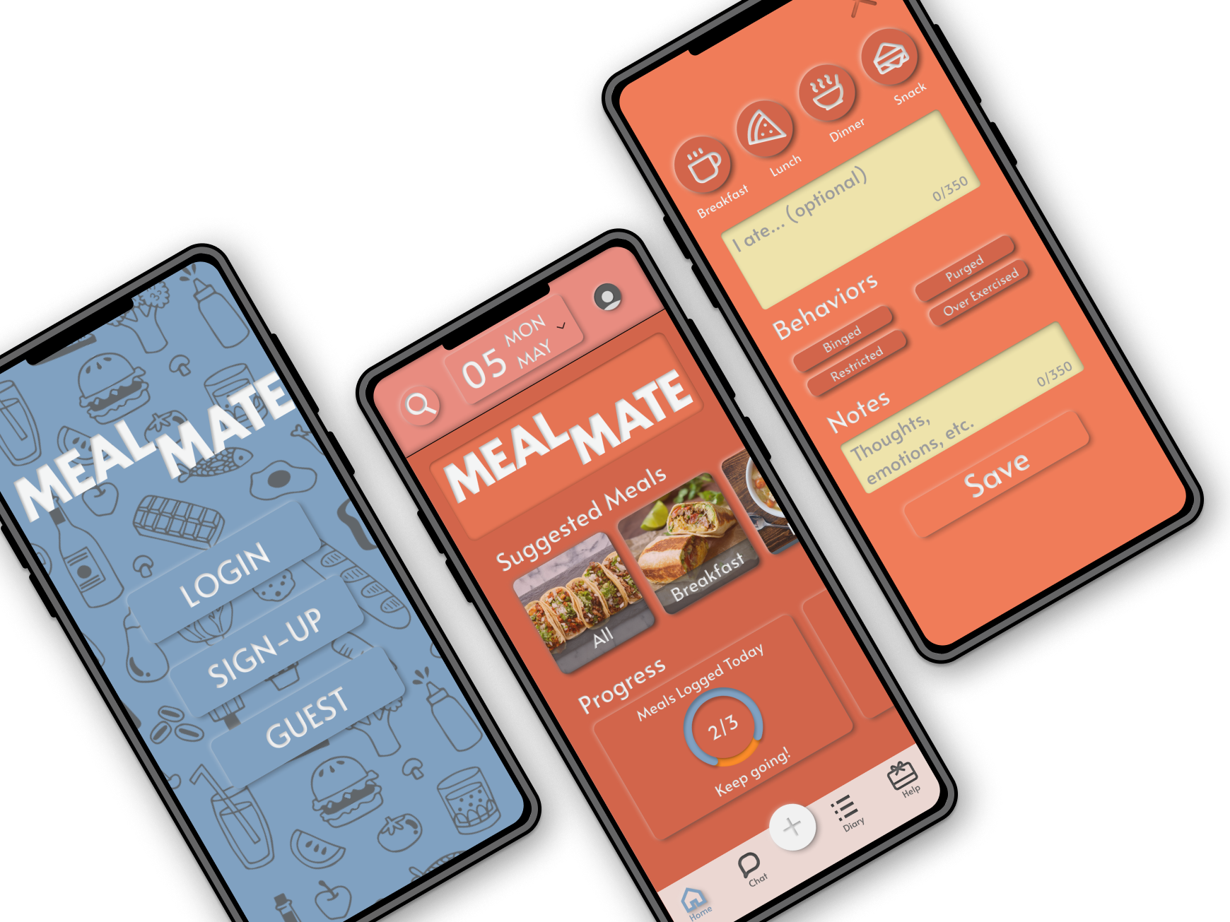
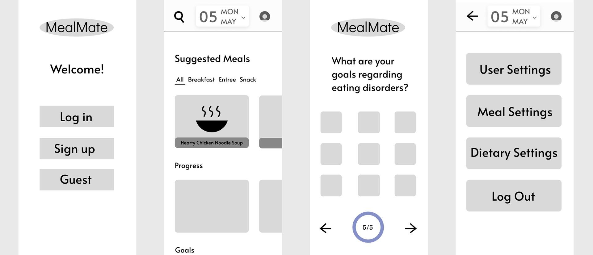
With the feedback I had received and some guidance from my professor, I was able to refine my design to be much more focused to the intended audience, as well as having a cohesive visual look that helped the app look more professional and accurate. With a neumorphic design and refreshed color palette, the app has much more depth and interactivity. Try the prototype below!
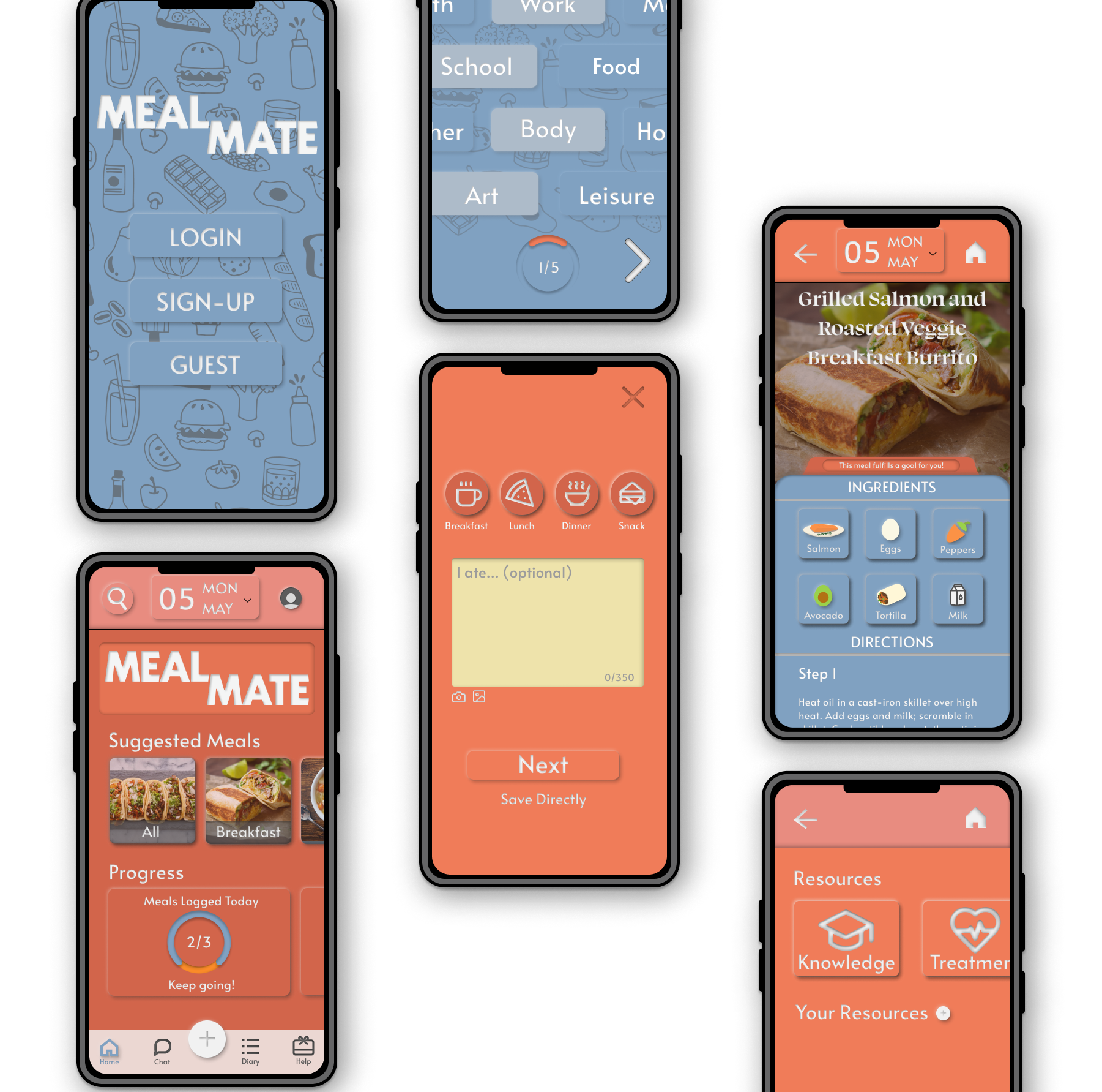
Refined Screens
Conclusion / Thoughts
This was my first project seeing a UI / UX design through from start to finish, and it was an extremely awarding experience. Being able to test out existing apps by observing users, find the gaps where I could create something new, and designing a working prototype like this was so informative on the design process.
Some key insights I picked up from this project were:
- Empathizing with potential users and finding places where they feel welcome
- Not being afraid to abandon ideas that aren't contributing to your core concept
- The value in observation and letting users tell you what they want
- Don't be afraid to ask for insights and help, you don't want tunnel vision
- An ounce of effort in preparation will lead to a ton of time and grief spared in the end (specifically when you're making wireframes and sketches)